Building a UI Framework with a Figma AI Design Agent: A Practical Guide
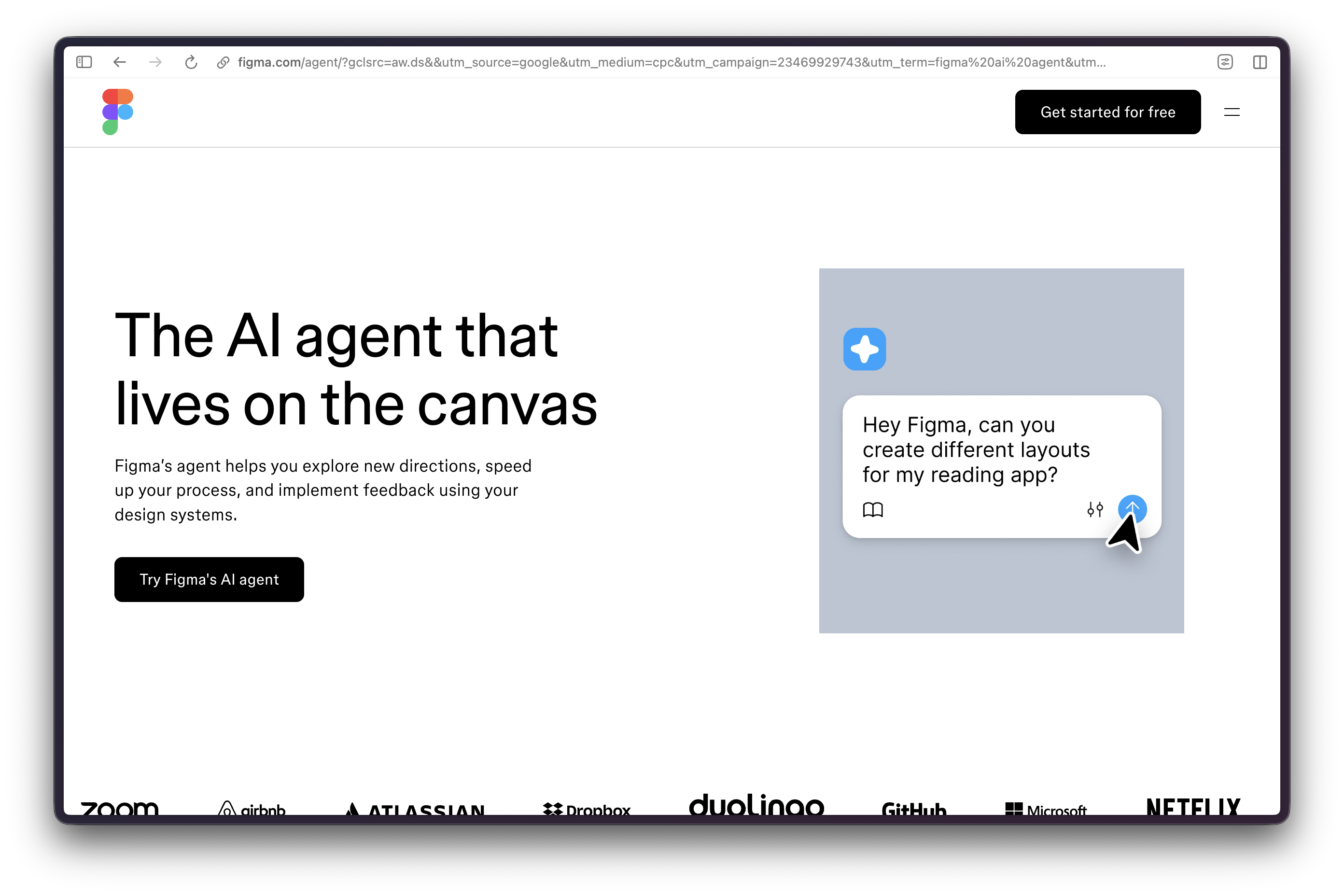
Figma’s design agent changes the first hour of design-system work. It can work directly on the canvas, use the components and variables a team has already established, and explore multiple directions before a designer settles on one. That is useful leverage. It is not a substitute for the decisions that make a UI framework coherent: token meaning, component boundaries, accessibility requirements, naming, and the release gate.
The operating mistake is to let an agent generate a library before the library has rules. Start with a small, explicit system; give the agent narrow jobs inside it; then review the resulting components as rigorously as code. This guide shows how to use Figma’s current design agent to accelerate that process without allowing speed to turn into design-system debt.
What the Figma Agent Is
Figma introduced its canvas-native design agent in May 2026. It works inside Figma Design, alongside the team’s editable files, rather than as a separate image generator. Figma says the agent can use frequently and recently used components as a starting point, and a designer can steer it by selecting a library or mentioning specific tokens, variables, and components. The product is rolling out in beta, so access and behavior can vary by account and plan.
That distinction matters. The agent can help create or alter design layers, compare directions, and apply feedback in context. It does not make a design system self-governing, guarantee that every property follows a team’s rules, or certify a resulting interface for accessibility or engineering readiness. Treat every result as an editable proposal.
Figma Make is related but separate. Make is Figma’s prompt-to-app environment for building interactive prototypes and web-app explorations. A productive pattern is to use the design agent to clarify screens, states, and components in Figma Design, then use Make when the question is behavior. Do not confuse a convincing prototype with production code or a released design-system component.
The Operating Decision
Use the agent when the work has clear constraints and many repetitive decisions: generating a first pass at a known flow, proposing responsive versions of an established pattern, or carrying approved feedback across a bounded set of screens. Avoid letting it define a new visual language, publish a shared library, or decide which exceptions belong in the system.
The best candidate is a team that already knows what its button, field, card, and navigation families mean, but needs help extending those patterns through a new product flow. The worst candidate is a blank file with a vague request to “make a scalable design system.” The first has constraints; the second produces attractive ambiguity.
Build the Foundation Before Prompting
Figma variables are reusable values that can support design systems and different modes, such as light and dark themes. Components define reusable design elements; instances remain linked to their main component, so changes can travel through the system. Those two foundations should exist before an agent is asked to extend a shared framework.
Start with a compact inventory:
- Token collections – Name the existing color, spacing, typography, radius, and other variable collections that the agent may use.
- Semantic intent – Decide the role of each token before naming a raw value.
color.action.primaryexplains use;blue-500does not. - Core components – Identify the main components that are safe to reuse: button, input, field, card, badge, modal, and navigation primitives.
- Allowed properties – List the variants, text properties, Boolean toggles, instance swaps, or slots that an instance is permitted to expose.
- Explicit exclusions – State which components, tokens, and pages are off limits until a human approves a change.
This is a working brief, not a database schema. The original draft’s token and component tables have been removed because they were generic reference designs presented too much like official Figma contracts. Keep a real team’s vocabulary in its library documentation, where the agent and the people reviewing it can use the same terms.
A Bounded Setup Workflow
- Choose one flow. Pick a contained surface such as sign-in, checkout, account settings, or a search result. Do not start with an entire product.
- Open the right library. Confirm the agent is looking at the intended components and variables. If Figma offers a library choice, select it rather than assuming the most recently used assets are correct.
- Write a component brief. Identify the user task, required states, content boundaries, responsive expectations, and accessibility review requirements.
- Generate alternatives, not a final. Ask for two or three distinct directions when the decision is genuinely open. Compare them before choosing one to refine.
- Make narrow revisions. Once a direction is selected, ask for one correction at a time: a missing error state, a spacing correction, or a different content hierarchy.
- Validate before reuse. Inspect the output on the canvas, test it as an instance, and send it through design and engineering review before it enters a team library.
The agent is most useful when its task is testable. “Create a mobile checkout” is a request for taste and hidden decisions. “Using the Checkout Card and Button components, add an order summary, an error state for payment failure, and a review screen; do not create new tokens or change existing component properties” is a request a reviewer can check.
Prompt for Constraints, Not Decoration
Give the agent a job, a boundary, and an acceptance check. A plain starter prompt can read: In the selected design-system library, create a first-pass account-security settings flow using only existing components and variables. Include a default, loading, success, and recoverable-error state. Do not create or rename tokens. Keep the content in one mobile frame and one desktop frame. Mark any missing component or token as a note for review instead of inventing it.
Then refine it with a narrow instruction: Keep the selected structure. Replace the hard-coded spacing in the alert area with the existing semantic spacing variables. If no suitable variable exists, leave a review note rather than choosing a new value.
That last sentence prevents a common kind of framework drift: an output looks internally consistent, but an invented near-match value or one-off component becomes a precedent. The purpose of the prompt is not to make the agent sound obedient. It is to leave a reviewer with a clear standard for acceptance or rejection.
Components, Variants, and Properties
Figma component properties are a way to make intended changes visible in a consolidated control area. Current property types include Boolean, instance swap, text, variant, and slot properties. They guide use, but they do not prevent someone from making other changes to a component instance. That makes property design an editorial decision as much as a technical one.
Before an agent touches a component family, define the small set of variations that deserve first-class support. A button might need intent, size, loading, icon visibility, and label. It does not need a variant for every marketing-page exception. A card may need a content slot and optional action area; it does not need a hidden catch-all property that turns every instance into a detached composition.
Ask the agent to propose missing states, then decide whether each should become a component property, a separate component, or an exception. Use Figma’s component playground in Dev Mode to test the agreed properties and variable modes without changing the design itself. If a component needs a complex explanation to use correctly, improve its documentation or simplify its structure before multiplying it through a library.
Accessibility Is a Release Gate
An agent can be asked to include focus states, text alternatives, and error treatments. It cannot certify that an interface meets a standard. Accessibility belongs in the review process and the production implementation, where semantics, keyboard behavior, motion, contrast, and assistive-technology behavior can be tested.
For a UI framework, write the expected checks into the component brief:
- Contrast and non-color signals – Review text and essential UI contrast against the applicable WCAG guidance, and make sure error, selected, and disabled states do not depend on color alone.
- Focus behavior – Specify where focus should land and how it should remain visible. Verify this in the implemented interface, not only on a Figma frame.
- Text alternatives – Record what an icon-only control must be called in product code. A visual label in Figma is not an ARIA label.
- State coverage – Include loading, error, empty, success, and disabled states where the user task requires them.
The useful test is not whether the agent included a focus ring. It is whether the team can explain, implement, and verify the behavior the component represents.
From Canvas to Code
Figma Dev Mode helps developers inspect designs, compare frame versions, explore component behavior, view applied styles and variables, and connect design assets to code, tickets, and documentation. Its Code Connect capability can show custom component code instead of generic generated snippets when a team has configured it.
That makes Dev Mode a handoff surface, not a production compiler. Engineers should still decide semantic HTML, state management, data handling, security, responsive behavior, and test coverage. A generated or suggested code shape can accelerate scaffolding, but it is not evidence that the result is accessible, maintainable, or safe to deploy.
Use this handoff sequence:
- Mark the Figma frame ready only after design review.
- Link the approved component, ticket, and written behavior notes in Dev Mode.
- Let engineering map the component’s documented variants to the project’s actual component API.
- Review the built interface against the Figma states, including responsive and error conditions.
- Feed confirmed implementation constraints back into the component documentation before the next agent-assisted extension.
Publishing and Change Control
Publishing styles, components, and variables to a Figma team library is a distribution event. Figma prompts consuming files to receive library updates, and publishing adds a checkpoint to the file’s version history. That is why an agent should never be treated as the publisher of record.
Assign a human owner for every shared-library change. Require a short release note that names the purpose, affected components, breaking changes, migration steps, and validation evidence. Publish in deliberately scoped batches. If a proposed change creates a new token, renames a property, or alters a component used across products, require an explicit design-system decision rather than folding it into an unrelated screen update.
Troubleshooting
The output ignores the library
Check which library and components the agent can see, then reduce the prompt. Mention the specific components, variables, and files that must anchor the work. If the required assets are missing or poorly documented, stop the generation and fix that context first.
The agent invents a token or a component variant
Do not normalize it because it looks reasonable. Remove the invented value from the proposed output, record the gap, and decide whether it reflects a legitimate system need. If it does, add it through the normal design-system process before asking the agent to use it.
The screens look polished but do not work as a flow
Inspect the states, transitions, empty conditions, and error behavior. Figma Make can help explore interactive behavior, but a prototype still needs product and engineering review. A successful happy path is not a complete UI framework.
The handoff produces generic code
Use Dev Mode to connect the approved design component to the team’s documentation and code resources. Treat generic code as a discussion aid, then replace it with the project’s semantic, tested implementation. Code Connect is most useful when the team has already supplied its own component code and examples.
The team is accumulating agent-made variants
Pause library publication. Audit whether the variations describe true reusable behavior or isolated page needs. Consolidate only after a human owner has decided the component contract. More variants are not evidence of a more mature system.
Operator Verdict
Figma’s agent is a strong accelerator for disciplined teams because it operates where the design work already lives and can be guided by the team’s components, variables, and library context. Its value is in fast exploration, targeted iteration, and repetitive extension of rules the team has already made explicit.
Do not give it the final word on those rules. Keep the agent inside a bounded brief, review every system-level change, verify accessibility and implementation outside the canvas, and publish shared assets through a human release gate. The resulting framework can move faster without becoming a pile of attractive exceptions.
Resources
- The Figma Agent Is Here – Figma’s official description of the canvas-native beta.
- Figma AI Design Agent – Current feature overview and access context.
- Figma variables guide – Official design-system foundation reference.
- Figma component properties – Official component-configuration reference.
- The Figma design agent is here – Figma’s May 20, 2026 Design Agent launch package and the source page for the embedded demonstration.
- Figma: Agent Documentation Prompt #3 – Direct Vimeo launch demonstration of Design Agent documentation work inside a design system.